5 step handout and a 5 minute video to show you how to create the look below. Enjoy!

|
|
|
0 Comments
Puzzles are on sale right now and I wanted to make another one using Artisan 6 this time. Working with blank page in Artisan 6 can be pretty daunting. So, I decided I wanted to use a template with lots of photos openings. 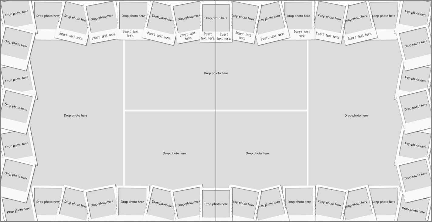 I decided to use my template MOBOT Polaroid. I pulled the template into a 12x12 project. Then I selected all the elements on one side of the layout, grouped them, copied and then pasted into the puzzle project. I repeated those steps with the right side of the layout. Then I aligned the two sides, grouped together and resize to fill the space of puzzle. Since I wanted more photos in the center of the layout, I resized the photos and created three rows. The top row had 6 (portrait) photo openings - approx. 4x6. The second row had square photo openings and when I resized them to fit inside polaroid frames which made them narrower than I initially wanted. They ended up measuring 2.558 W x 2.84. That row had 9 photo openings. The bottom row were 4 landscape photo openings - measuring approximately 6x4. After I added the photos I realized I wanted some separation between the rows, so I created some trim pieces by adding a rectangle with a 3D bevel edge effect applied. It was a little over 24 inches wide and 1/2 inch in height. I put the title on top of the strips to make it more visible. 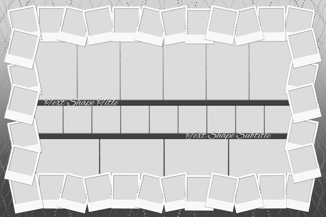 Completed puzzle design.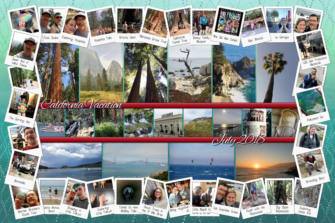 I am super excited to see how it turns out. I plan to create a video showing this process for those of you who learn better from a video. :) I was looking through blueprints and found the one I wanted to play with. It is called Shrimp & Grits and was released in December 2019. I will use this template to create a puzzle when I do the video demo. 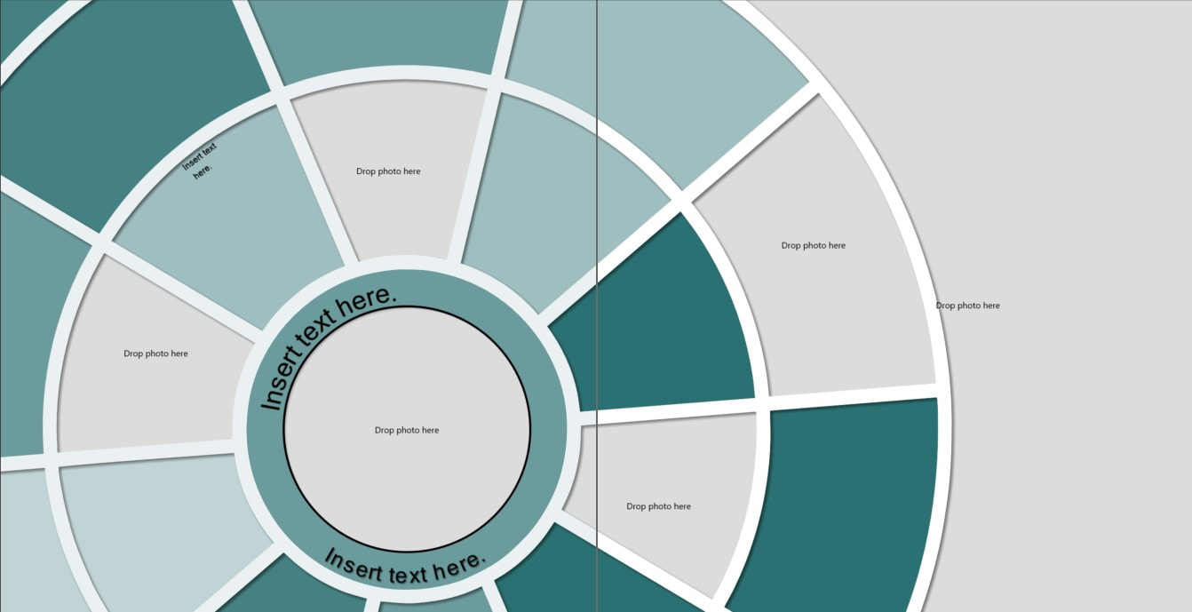 TIP: When getting ready to create a puzzle, I found it helpful to go through my photos and pick my favorites. Then, I only brought in those pictures to play with.
 While I was creating the above page, I added the title on the bottom left and wanted to add more color to the page. In the process of figuring this out, I came up with the technique separated titles. In the close up images below, you can see on the left the title is just yellow. On the right, I have added a section that is pink and have applied the 3D bevel edge effect.   SamplesAll fonts can be found on dafont.com. Check out a fun idea for titles on your pages using a text shape, a stroke, glow border, flattening, & a shadow.  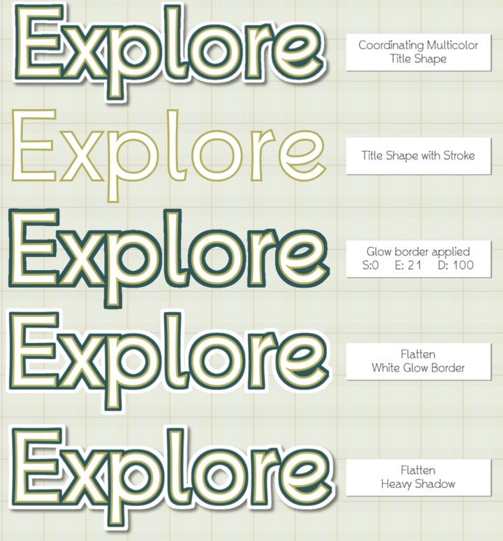  There are many things that I do to improve the appearance o my photos. Sometimes I edit them to improve the color and others to remove blemishes. In this particular photo I loved the otherworldly feel of the Galaxy's Edge area of Disney's Hollywood Studios Park. I didn't really love seeing all the people in their brightly colored summer wear. So, my goal was to remove them as a distraction without having to clone them all out. I went to the Adjust Ribbon in the Historian image editor. I used the Lasso selection tool to select the bottom of the photo. I applied the rough painting filter and blur to the selected area. Then I went to the Touch Up Ribbon and applied the Decrease Color brush. Finally, I did some additional blurring using the Blur brush on the Touch Up Ribbon. When I get to adding this to a page, the bottom of the photo won't be pulling attention away from the cool atmosphere of Galaxy's Edge. Before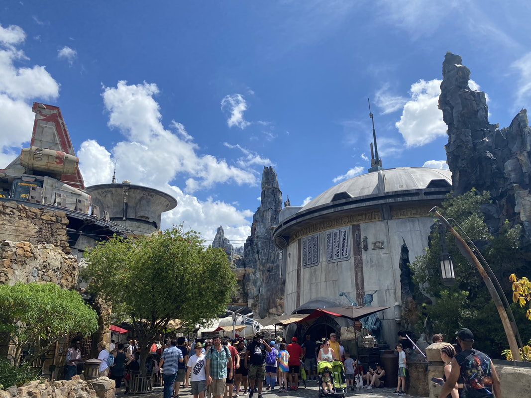 After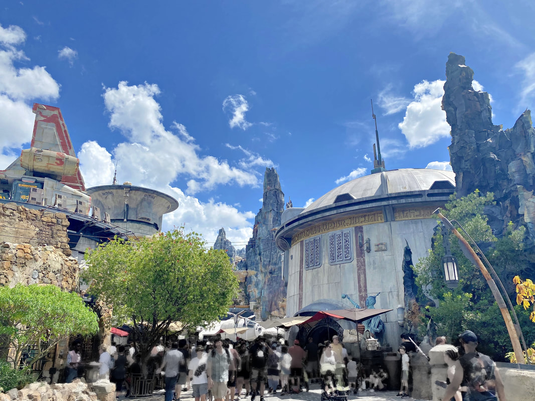 Last night during my Virtual Café I was asked what are my favorite fonts for journaling. I have LOTS of fonts. 1000's. So, my list of journaling fonts is quite long. I ended up taking screen shots of the fonts I put in the journaling group in the Font Manager in Artisan. But, let's back up a minute. Did you know that you can organize your fonts in Artisan? First, go to the Content Manager and then in the Manage section of the Content Ribbon, click on "Fonts." 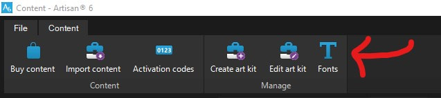 Next, your font catalog will pop up. It comes pre-loaded with some suggested groups. You can add additional groups and remove any of their suggested groups that you won't use. Then, just select one of the font groups from the drop down list, select the font(s) you want to add to it, and then click add. 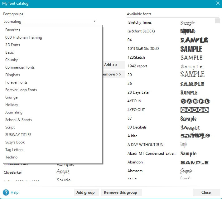 You will see these font groups at the top of your list of fonts whenever you are choosing the font for a text box or text shape. My Journaling Fonts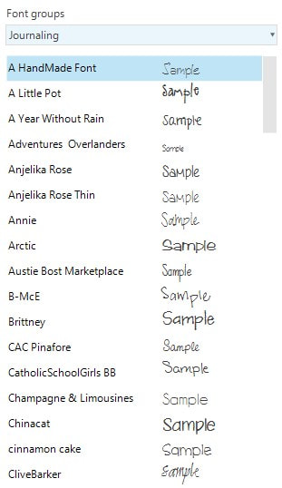 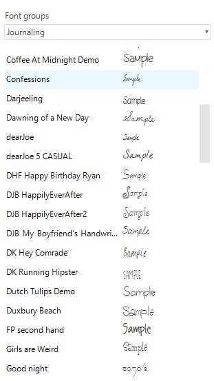 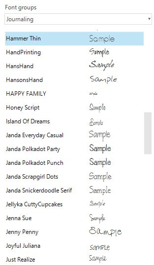 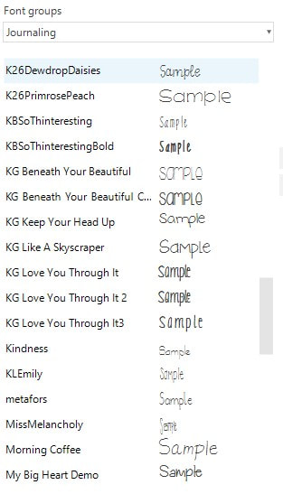 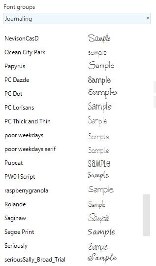 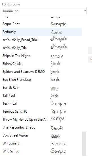 There are sites where you can get fonts for FREE and others that you can get bundles of them inexpensively. Here are some sites I have used before. dafont.com: FREE fontsquirrel.com: FREE fontbundles.net: For purchase & some FREE CreativeMarket.com: For purchase & some FREE There are many more, of course, but this will give you access to many to play with. Did you know that you can apply color wash in multiple layers to create a deeper cover of one color? 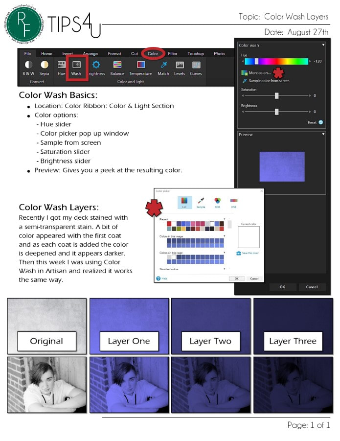
Video Notes: Here is the process I went through to plan out the wall of canvases.
My Canvases :) |
AuthorI've loved photography all my life. Have been making photo albums since high school. I love helping people do something memorable with their photos. Have so much fun planning workshops for people to get together and work on their photo projects, share stories and fellowship. Looking forward to making this even easier with new products that will make it a snap to finish. Archives
May 2024
Categories
All
|
 RSS Feed