
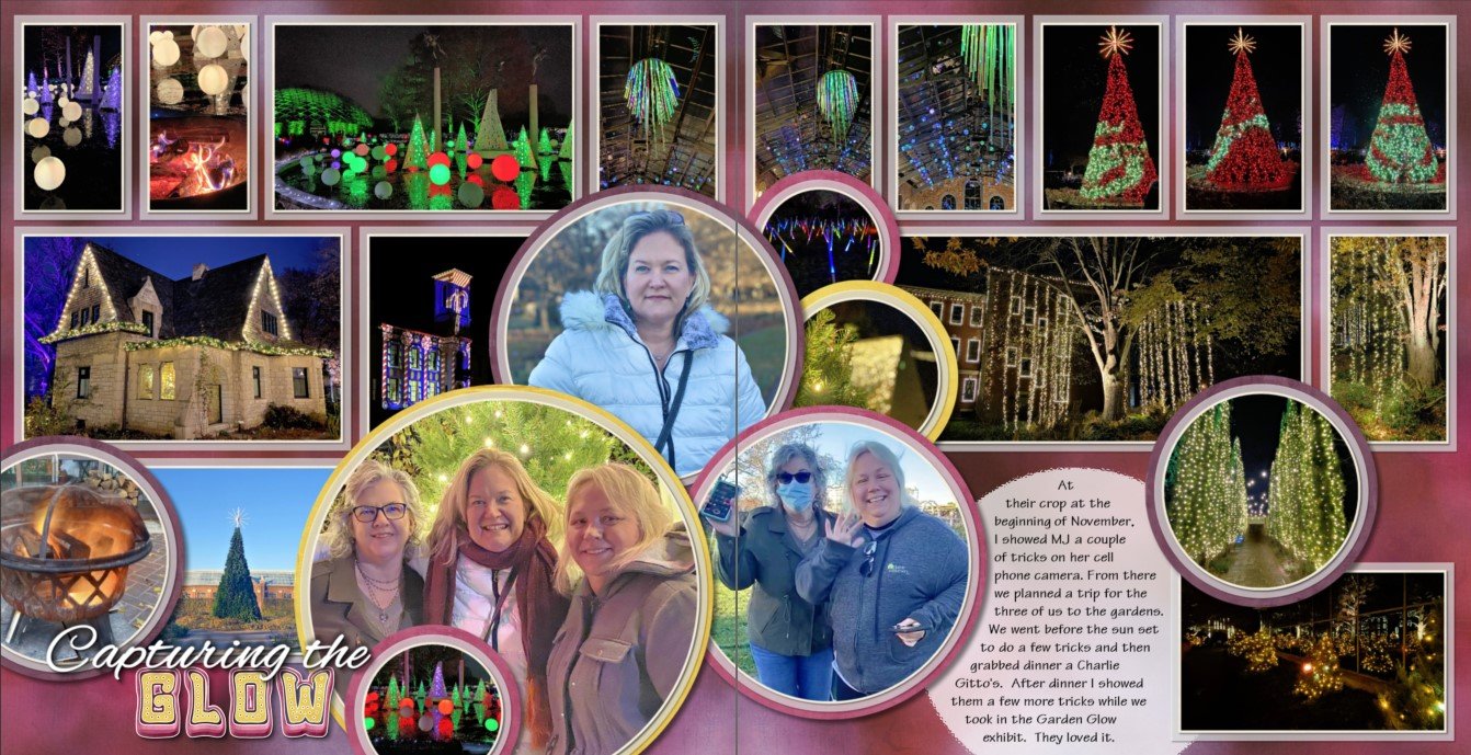
I was chatting recently with someone working on organizing her content. If you are just starting this process, using categories gives you a quick way to throw entire kits into an organization system. You can group them by seasons (Spring, Summer, Fall, Winter), holidays (New Year's Day, Valentine's Day, etc.), digital artist (Cottage Arts, Mags Graphics, Seatrout Scraps, etc.), themes (birthdays, travel, boyish, girly, etc.), styles (art deco, farmhouse, etc.), and more.
Other uses for categories:
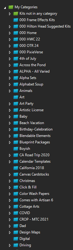
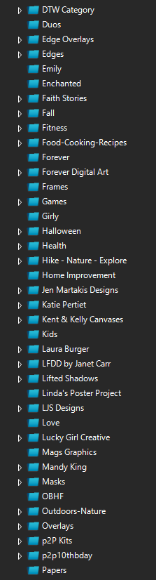
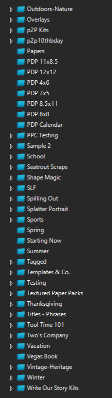
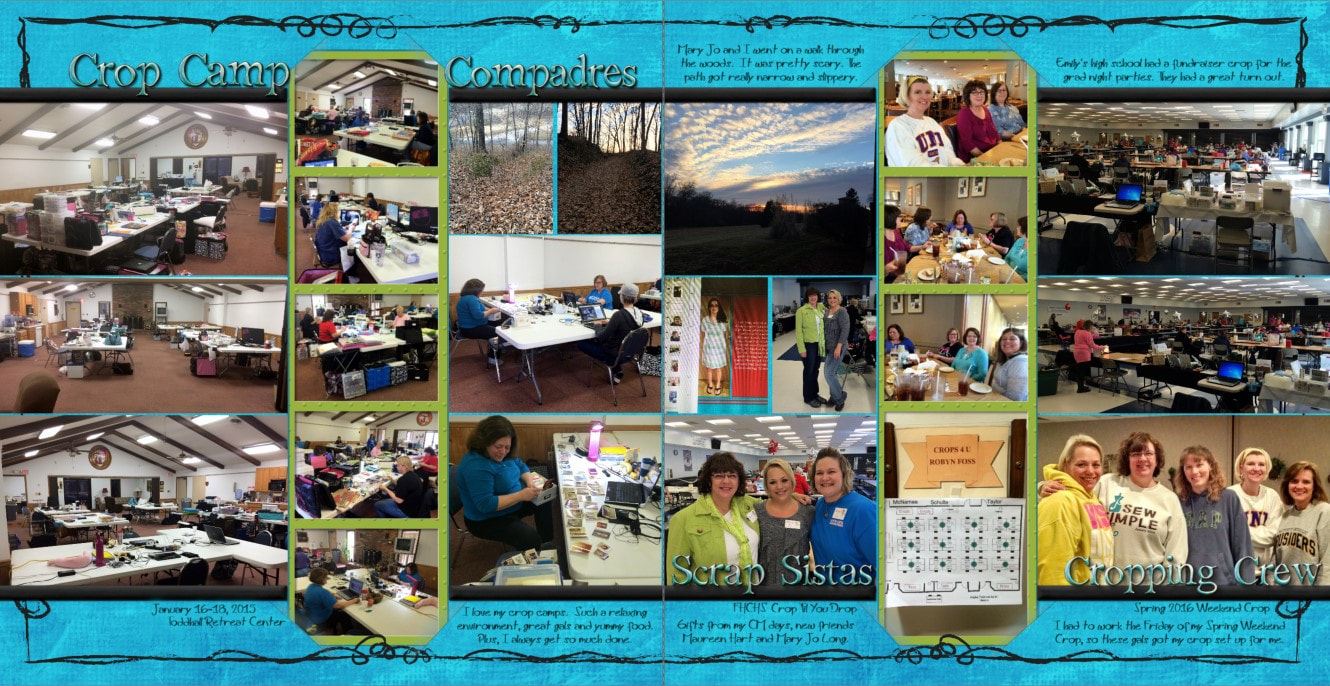
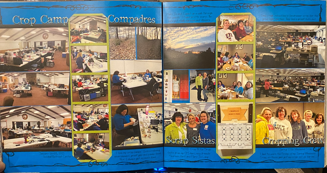
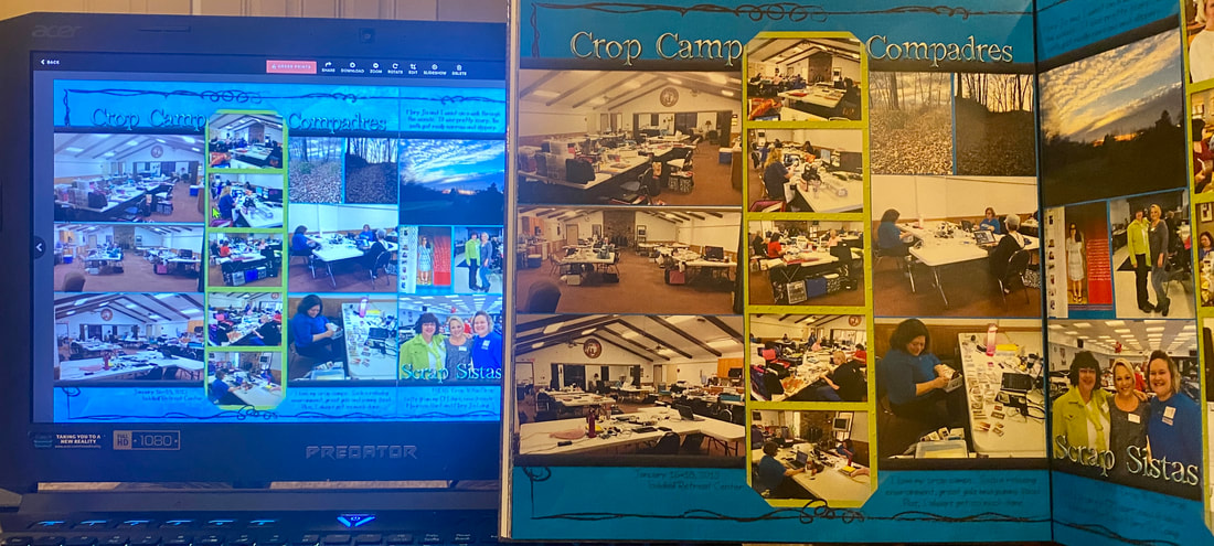
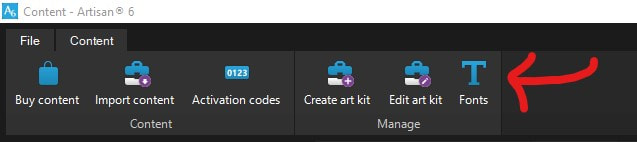
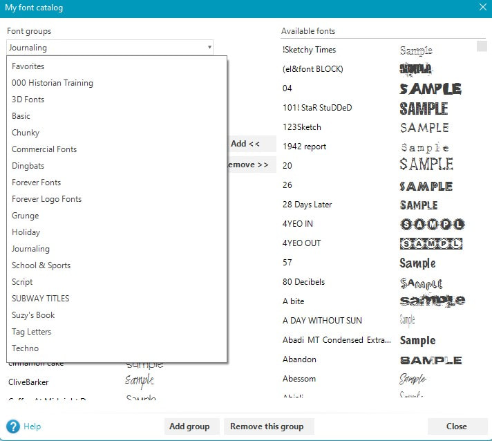
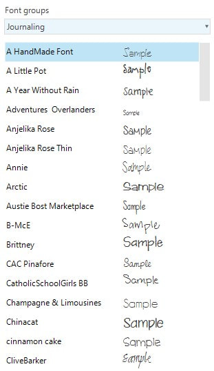
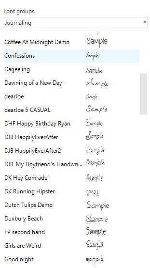
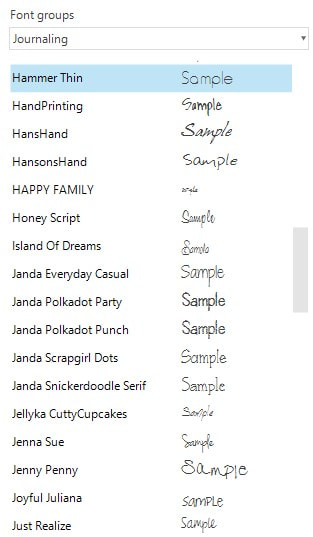
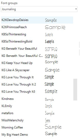
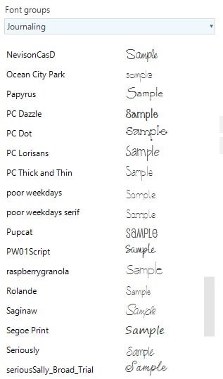
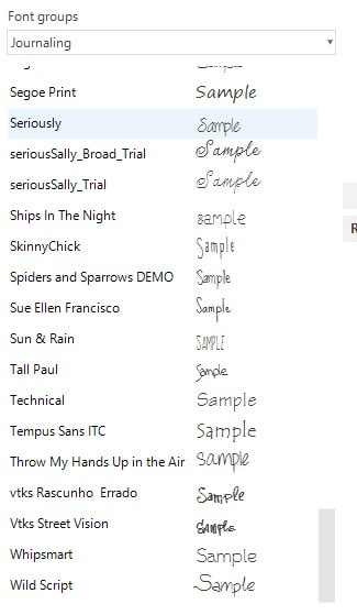
Below you can see some screen shots I took of my categories. I hope this helps you get started on organizing your content. More training can be found in the getting started guide (see page 27). Click the blue button to open a handout on this topic from the Getting Started Guide.
Other uses for categories:
- Pick kits you want to use on a particular project so that you don't have to look through all your kits when completing pages.
- One time I did this and then deleted the category after the project was done. I regretted that because I really liked how those kits worked together. I would suggest renaming the category rather than deleting it.
- Create categories for temporary use. You can look through your content in the content manager and throw kits into a temporary category that would be at the top of the list when you go back to the page you are working on. I use "000 Home."
Below you can see some screen shots I took of my categories. I hope this helps you get started on organizing your content. More training can be found in the getting started guide (see page 27). Click the blue button to open a handout on this topic from the Getting Started Guide.
 RSS Feed